
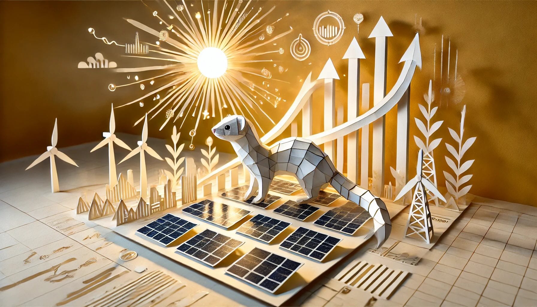
Cheese, Child Marriages, Solar Power & Shadowrun
Solar power charts, a cheese-themed data viz guide, and a child marriage data portal worth your attention.

.... but first, nuggets.
With another slightly late chronicle this week (my routines are not stellar lately, urgh), I decided to jump down the rabbit hole of finding cool visualizations and insight’s I’ve run across lately.
The main one that I want to highlight is the recent work by the Economist around where solar power is as technology, and it is MUCH further along than you’d think. It is an incredible example of hopeful narrative using data.
But first, a few cool nuggets!
Say Cheese With Your Chart

Background: The Financial Times is well known for its Visual Vocabulary that is free to download as a massive PDF here: Charts that work: FT visual vocabulary guide
The original is cool in itself, but Say "Cheese" With Your Chart by London School of Communication is a really cool print derivative.
It’s a hardcover book printed based on the FT Visual Vocabulary, with semicircular opening along the ridge to enable tactile referencing (and also add to the thematic visage that the book resembles a block of cheese when standing up).
It is completely printed in yellow and black, and it uses data from a fictional universe called 🧀 Cheeseland to enable concrete and pedagogical examples to contextualize the guide, to make it easier and more entertaining to understand the vocabulary.
I have unfortunately not managed to figure out where one can find a copy of the actual print edition, but you can read it for free online here (Say "Cheese" with your Chart - online)
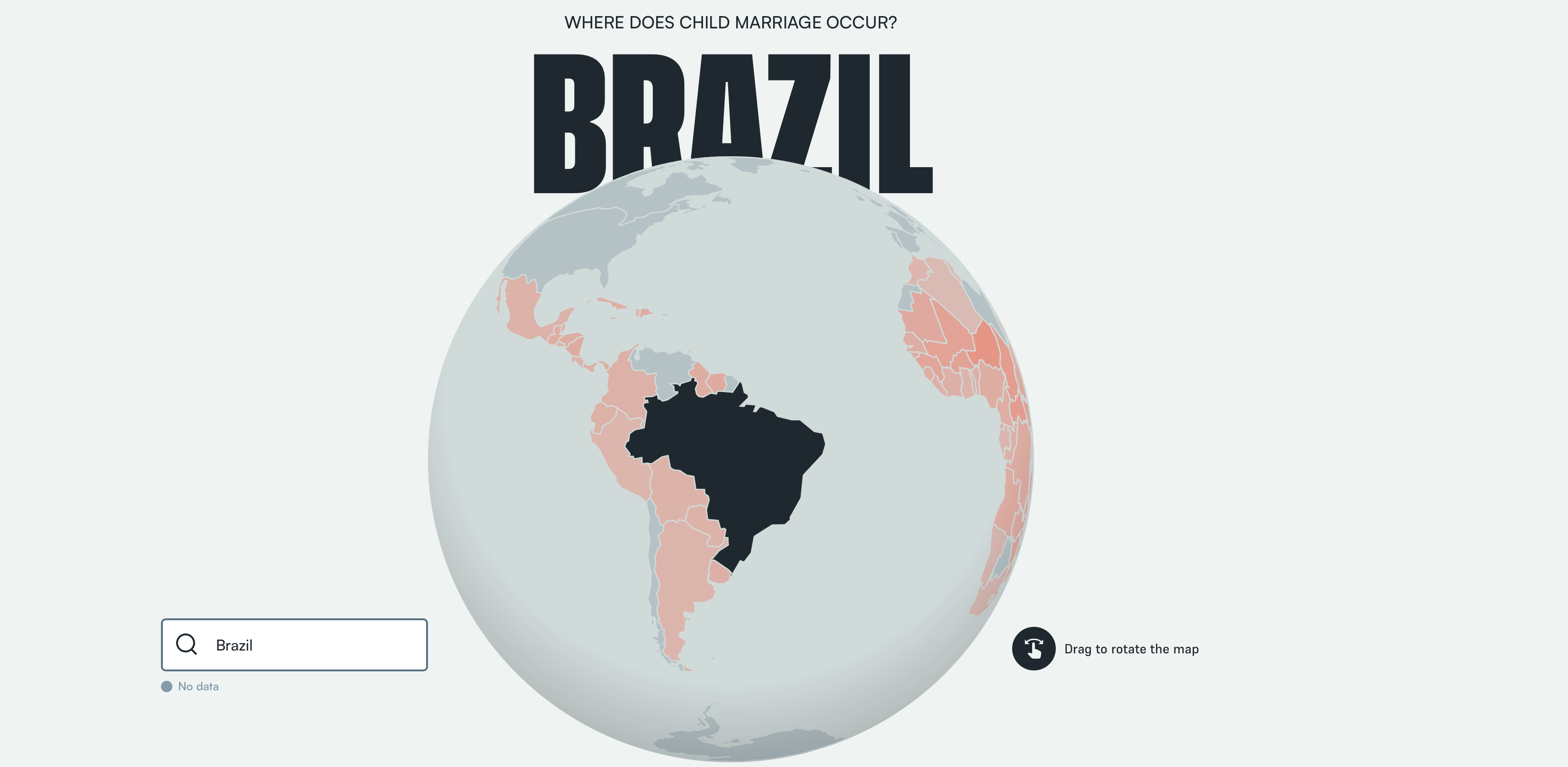
The Child Marriage Data Portal
My partner works in the field of child abuse prevention, and by extension she has made me more aware than the layperson of the staggering size and complexity of child abuse as a global challenge.
That so much child abuse occurs in the world is a subject that most prefers not to spend too much time thinking about, but ironically that unawareness is what enables much abuse to occur.
I don't mean to imply here that visibility is everything needed to solve problems, but most evil is committed in secrecy, shrouded by common ignorance, so data projects that shine a light on the matter, especially in engaging, accessible ways is very close to my heart.
Thus, The Child Marriage Data portal is an incredibly beautiful and interactive visualization. I really like how the main country selector is kind of a menu item, data visualization and hero banner rolled into one.
The Economist on Sun Machines
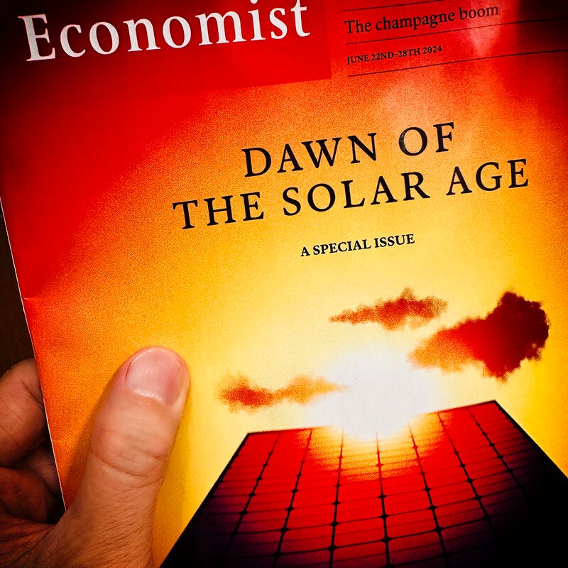
But what has been on my mind most lately is the Coverage of solar by the Economist. It was a special edition of the Economist with a series of articles, but the one that I caught my eye, a and particular visualization in it, was this essay: SUN MACHINES: Solar, an energy source that gets cheaper and cheaper, is going to be huge
The article is unfortunately subscriber-only, but if you don’t want to get one, there is a good video cover of this article by Money and Macro below:
Money and Macro showcases the visualization I am talking about in the first 20 seconds, but when I watched the video, I had a hard time parsing it at the time of viewing, because the visualization is actually interactive and gradually revealed when you scroll down the article, and interestingly dependent on the interactivity to be parseable.
I am generally not super stoked on scrollbar overrides, but this was quite a cool use. I did a dirty screen capture myself to give you an idea, I did it slow so that you can use the video progress bar to "scroll" through it yourself:
I find this plot interesting because to be is quite hard (or rather, impossible) to parse when seeing it in it’s final state because of the overlapping prediction lines. When it is gradually revealed, however, the amount of data points becomes less overwhelming. In addition, since this plot really does tell a story, the gradual revelation really makes sense, making it a bit exciting to follow.
While this kind of sort of works in a video, there is something lost when the interactivity is removed. When I am allowed to scroll myself, revealing more data as my cognition absorbs each set of data points, the story is paced for me.
In addition, the suspense is built as the story goes on, and every reveal by me, triggered by my curiosity, is rewarded with more information, another step in the story. Plus we love to see charts go up, as well, it’s a very nice experience to go through, this little scroll-chart.
The Economist actually has 50% this Cyber Monday (not sponsored, I just love the Economist) so if you have been thinking about getting a subscription, today is the day.

Interactivity really is key to being able to “intuit” complex data. If you do it correctly, a layperson can figure out quite complicated things.
I picked up replaying Monument Valley last weekend, and that game is a fantastic example of how adding feedback mechanisms allows the player to intuit super awkward Escher geometry. It seems unbearably complex at first, but as you rotate the levels around, your brain quickly starts “wrapping” itself around the geometry.
It is quite fascinating that we do this - it’s like the human brain is evolved without any assumptions around how reality works, and can just kinda roll with whatever, walking in impossible Escher levels with ease after a while.
I found the Geometric Room level of Idas Dream particularly interesting in this regard, its just lines (0:59 into the video below):
In the same vein, we can also think quite flexibly around time, which games like Braid will show you after you go into the levels more deeply:
On the same note of “intuiting data” I started leafing through the 1991 edition of Virtual Realities: A Shadowrun Sourcebook just because I found it on a friend's bookshelf.
While I never played Shadowrun, I did play RPGs in my teens and back then I found it somehow soothing to just sit and read rules about how a world worked, in hindsight understanding that seeking a world with clear rules is an escape from the unpredictable, uncertain real world, where doing the right thing still might yield a bad outcome.
Now that I think of it, dice-oriented RPGs actually do add an element of randomness with critical misses etc. Randomness is actually a prominent element of the game. For example, in Baldurs Gate 3, dice are featured VERY front and center. However, here, randomness is contained in one space, in a familiar form of dice, and you have various ways of affecting the randomness - compared the overwhelming randomness of the physical world we live in, it is very manageable.
However, as I leafed through the pages, I realized that I seemed to have lost my interest in reading rules like this as I grow older. Maturity is to a large degree becoming more at peace with the uncontrollable unpredictability and chaos that life is, and even though I sometimes feel like a child, encountering things that gave me comfort as a child but no longer shows that I have learned something at least.
I was about to close the book and put it back on the shelf, when I got to a novella part of the book, which is quite extensive - it is an incredible short story about a being (not clear if it is an AI or not) born in the Matrix. The Matrix in Shadowrun is a Virtual Reality construct, but it is not primarily the simulated world that is envisioned in other sci-fi, but more something like “the Grid” in Tron.

In Shadowrun, the virtual reality of the Matrix is a physical interface, a GUI, made to allow humans (cyberdeckers, hackers) to handle much more information by “translating” it to the nervous system, so that the decker would not be limited to the “conscious” minds processing power, and make make use of the greater bandwidth that the neurology of motor control, object vision and general intuition affords.
I.e. virtual reality in sci-fi, and our current explorations, is of skeuomorphic, trying to look like the real world, but this is not at all the world of Shadowrun (which I suppose has its roots in Neuromancer, but not sure) where things a intentionally symbolic, yet still made so that humans can intuit easily, such as often making use of polyhedra (particularly fascinating Wikipedia article btw) because humans can intuit those easily, etc.
I do believe that there is a lesson there, for anyone that seeks a career in data visualization - we do have human-computer-interaction as a field (which is sooo bizarre as a title when you consider that "computer" used to be a job title for humans), but the term human-data-interaction is not something you hear, even though that is kind of what we are talking about, in it's essence.
Nat Bullard & Halcyon
On a final note, I found a fascinating cookie that I started following - Nat Bullard, who is credited for some of the analytics in the economist article, has done a writeup about it here: Understanding the Sun Machine
Nat works as CSO for an incredibly interesting stealth-ish startup called Halcyon that “is building an AI-assisted search and information platform that helps those navigating the energy transition find valuable new sources, understand shifting market dynamics and answer complex questions quickly”.
It seems to me to be a NotebookLM, but that is more of a professional tool that can pull together quantitative data.
You can sign up for the Halcyon waitlist here (also not sponsored, just soooo cool)
As always, stay curious 🧐🐒
Mattias Petter Johansson