
Data physicality, materialization and Four-Byte Burger
On turning data into tactile artifacts, papercraft habit trackers, and why physical beats digital for behavior change.

"Thank you, my Chinese spy. I will miss you forever."
Soooo TikTok got banned this weekend. Not particularly relevant to this blog but I really did enjoy the poetry by the Economist on the matter:
AS A SHUTDOWN looms, TikTok in America has the air of the last day of school. The Brits are saying goodbye to the Americans. Australians are waiting in the wings to replace banished American influencers.
And American users are bidding farewell to their fictional Chinese spies—a joke referencing the American government’s accusation that China is using the app (which is owned by ByteDance, a Chinese tech giant) to surveil American citizens.
It is also a nod to the personalised feel of each user’s “For You Page” (FYP), the app’s algorithmically curated stream of videos. “Thank you to my Chinese spy for perfecting my FYP and understanding me more than anyone else. I will miss you forever,” one video signs off.
(From: A protest against America’s TikTok ban is mired in contradiction - Economist.com)
Data physicalization
Anyhoo
This week I've been musing around data materialization, that's the best word I can find for it. Or perhaps data physicalization?
What I mean by physicalization is a process very similar to data visualization in terms of thinking and goals, but not limited to merely visuals, and specifically manifesting data as material in the physical world, often in interactive ways.
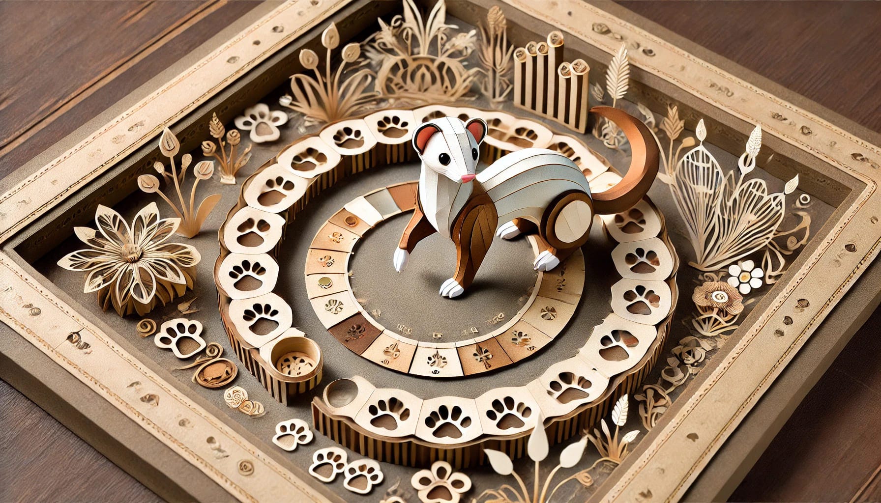
MPJ makes a papercraft heart bar chart habit tracker for 2025
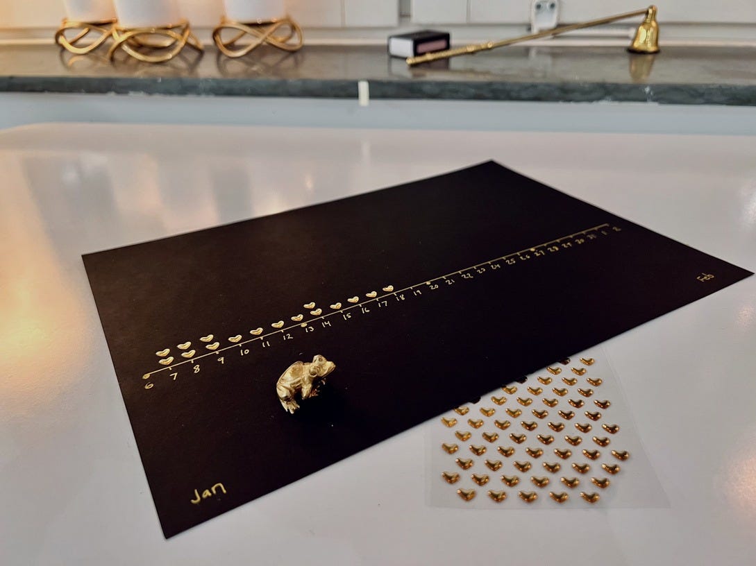
I have created paper-based trackers with stickers before, and based on learnings from earlier versions this one had three specific design goals:
Should feel decidedly tactile, little dependency on writing, and specific use of stickers that bulged out of the page, and that you can run your hand across and get a distinct feel of (basically, you should be able to consume the artifact with your eyes closed)
The data should be tracked in a uniform format that could be easily compared over time. This is why the axis starts on day 6 and not day 1 of the month, and only shows 28 days at a time, as opposed to the full month.
For the same reason, Mondays are clearly marked on the axis, so that one can easily compare 4 weeks to the 4 weeks before it. We really want to take the cyclicality of the week into account in this data since we are comparing habits here, where adherence tends to be heavily influenced by weekends, this way of comparing makes a lot more sense.
The artifact should be easily made by hand, pen and paper (well, and a ruler). This is for many reasons, but one important one is that it bounds the design process.
The artifact should be extraordinarily simple, but no simpler - have exactly the amount of design elements needed to achieve its goal, and no more.
That last point is implicitly about a fifth meta-goal; that it should disincentivize configuration - many habit tracking apps, such as Streaks on iOS, which is very minimalist as apps go and I want to tip the hat to, still has so much configurability and functionality that is seductive to me and makes me spend more time with the meta of the habit tracking than doing the habit itself. I know it has helped many, but it always trapped me in the phone rather than making habit change in actuality.
This is a sin tenancy, of course, isn’t limited to digital solutions. I am probably stepping on toes here, but I think the Bullet Journal is an example of a system that is way too configurable and allows you to procrastinate with the system instead of doing the actual thing the system tracks.
One could consider this a user problem, but I think that is a copout. The whole point of a system is to guide you to do the right thing, so we should go to great lengths to ensure that the system doesn’t become a culprit in the drive that it is striving to protect from.
And yes, I just called Bullet Journals a dirty cop in the productivity police. 🤣
Preliminary results

After a few weeks of use, it is clear that this form of tracking is very, very satisfying, which is one of the main success metrics of creating a physical artifact instead of a digital habit tracker.
It does have a "coin collecting" effect and placing out markers for your habit occurrences is something the nervous system understands very well, and triggers the reward loop of the brain
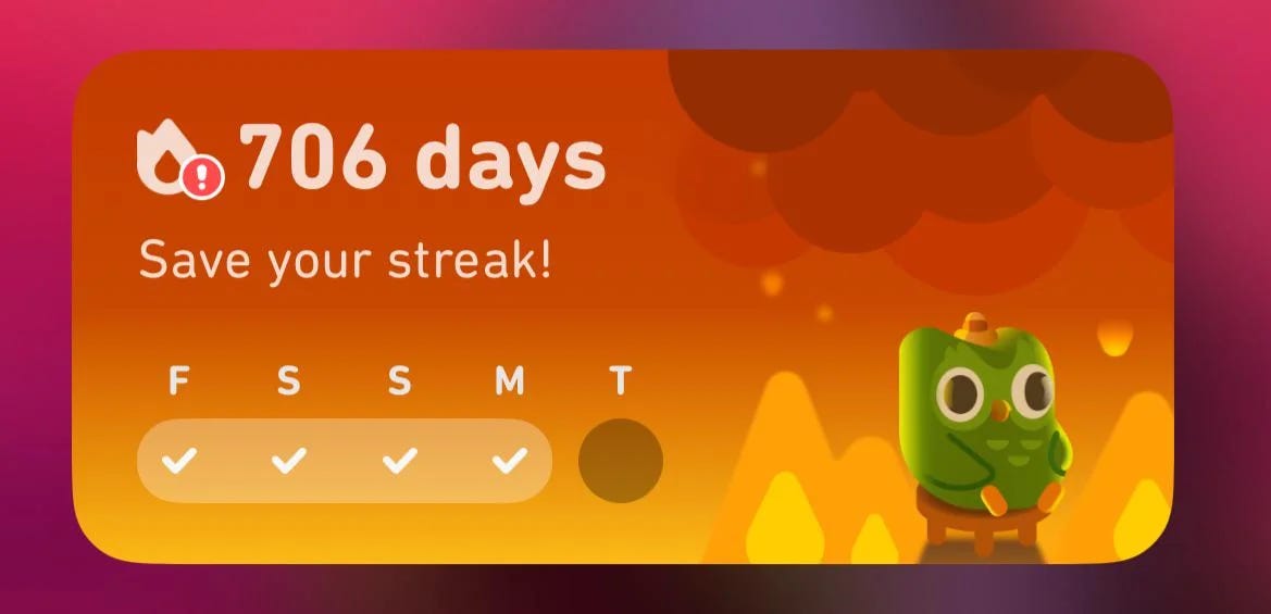
It also does have, to a degree, a "streak" mechanic and it does incentivize you to not skip days, but doing so doesn't feel "broken" as many habit trackers tend to inherently model a skip day as. Even the ones that do model skipping as okay still tend to have a "failure" feel around it - the below is the Duolingo widget warning you about breaking a 706 day streak, imagine seeing this on a day when you have a deadline at work and while driving your cat to the vet:
The papercraft tracker is very much not that - it is simply creating a bar chart of hearts of how many times you perform the habit.
The papercraft bar chart tracker is observing yourself rather than "tracking" yourself (something that a hunter does to prey).
There is no “wrong” state - however, what is established is a visually clear baseline, that you can visually compare yourself against next month. i.e. What you are comparing towards is not someone else or a wishful thinking ideal.
The most natural comparison when we are drawing a plot is you, yourself, in the prior period.
How can I learn to love computers again?
This little project is, ironically, related to a life theme where I try to rekindle my love for computing.
I used to really, really LOVE computers. They were pure sources of joy for me.
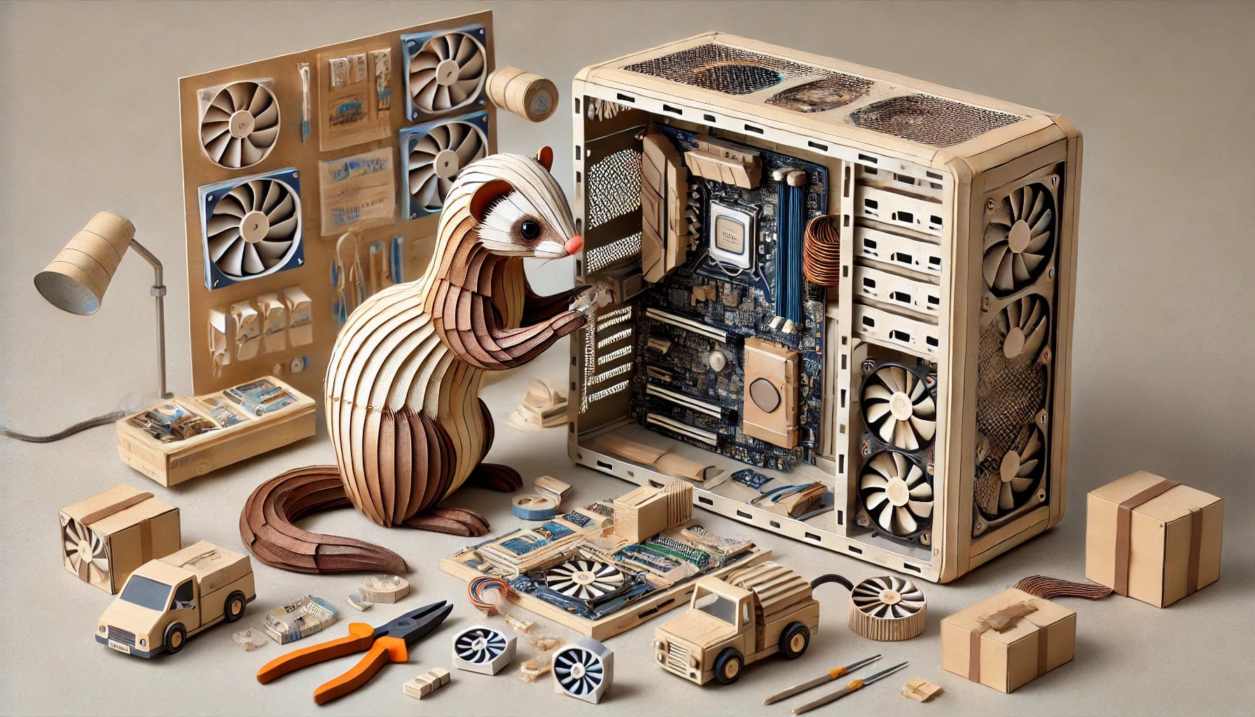
When I was in my teens, building computers in ATX cases was something I did quite a bit, and it was a hobby, a tinkering project of mine. When I think back even further, to my old Amiga 1200 (Wikipedia), I am filled with warm fuzziness.
I also used to really, really love my smartphone. There was so much delight in my iPhone, but somewhere along the line I lost control over mine and it ran me for a while. These little devices are so versatile, contain so much of … us, and what we do, that it has become a priority for anyone that wants our money or attention to breach this thing.
Smartphones are pretty secure in terms of technical cybersecurity, but I find that there is another type of yet-to-be-named shielding that we need to figure out with these things, in terms of guarding our attention.
Apple is certainly doing a lot of work in guarding me, with privacy controls, screen time, notification filtering etc. but I feel like it is woefully inadequate, it feels like the whole system has design considerations that make it a Sisyphean task to shield my attention - notifications are just too powerful per definition kind of, that is something that my life partner and close family and friends should have, corporations should not even be able to gain that access, so much of the attention grabbing that apps do should not even be possible to request.
I've been seriously yearning for a Light Phone 3, and the fact that the product category is getting a third generation is really telling that I am not alone. This device is just gorgeous and it just fills me with calm just looking at it:
Introducing the Light Phone 3
Clawing back control, one use case at a time
I have been exploring ways to extract certain use cases from the phone, in this case - habit tracking. It was something that I would have done via app earlier, but honestly, that very rarely worked for me - probably for the same reason why I find that Morning Pages loses much of its effectiveness for me when I try to do it on a digital device more advanced than a Remarkable.
I started doing a lot of things (such as habit tracking, timekeeping and alarms etc) on the phone because it was convenient, but all this functionality convergence had a cost that only emerged over time - that the entire world uses one of two operating system for their morning alarm click has made it very important for companies to get in there as much as possible in order to get as much as your prime attention as possible as early in the day as possible, because that attention is monetizable.
Now that many of us are treasuring time away from the phone, the use cases for which the phone is only kinda sorta good at (because it isn’t a dedicated device) become dubious. Below are two projects which I found inspirational this week:
They Never Shipped, So I Built My Own Focus Dial
Building My Dream Productivity Device
Munzner's wonderful definition of dataviz
In her epic, classic book, Tamara Munzner has a really cool definition of data visualization:
Computer-based visualization systems provide visual representations of datasets designed to help people carry out tasks more effectively.
[...]
Visualization is suitable when there is a need to augment human capabilities rather than replace people with computational decision-making methods.
One interesting trait here is that visualization is only needed when an automatic solution isn't available - we don't need vis if a fully automatic solution exists and is trusted (we very much still need visualization to inspect the performance of a not yet trusted automated solution)
The same definition is true for materialization, but here we can extend the definition to also include when data gathering has to be done by collecting observations from persons, and also motivating and engaging the given persons to actually provide the data (or engage with and understand a materialization of it)
Pulling data out of the digital realm
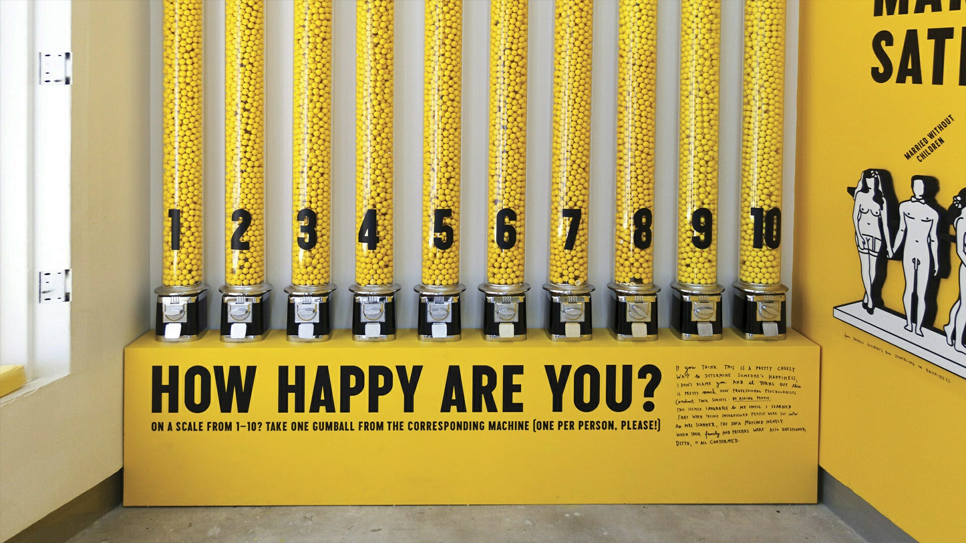
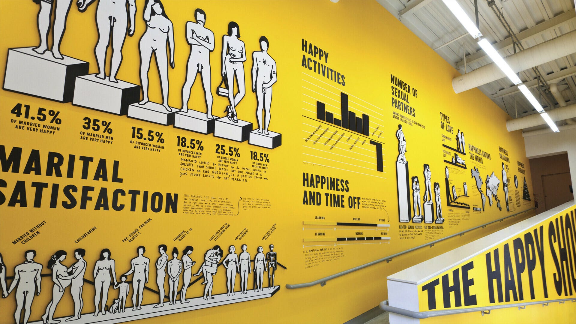
Once I started down this rabbit hole I found other examples, I particularly liked Stefan Sagmeister's use of yellow gumball machines in The Happy Show (to be honest mostly because it is so yellow)
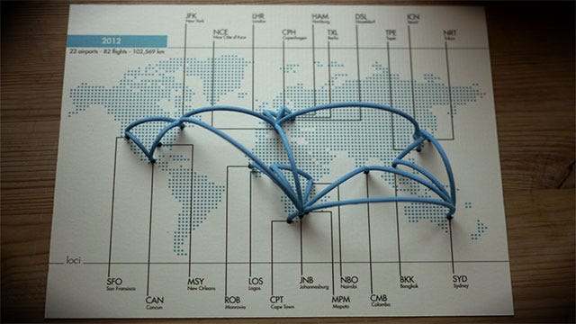
I also loved loci - a 3D printing software to visualize your TripIt flights, that is sadly no longer available (at least I couldn't find it):
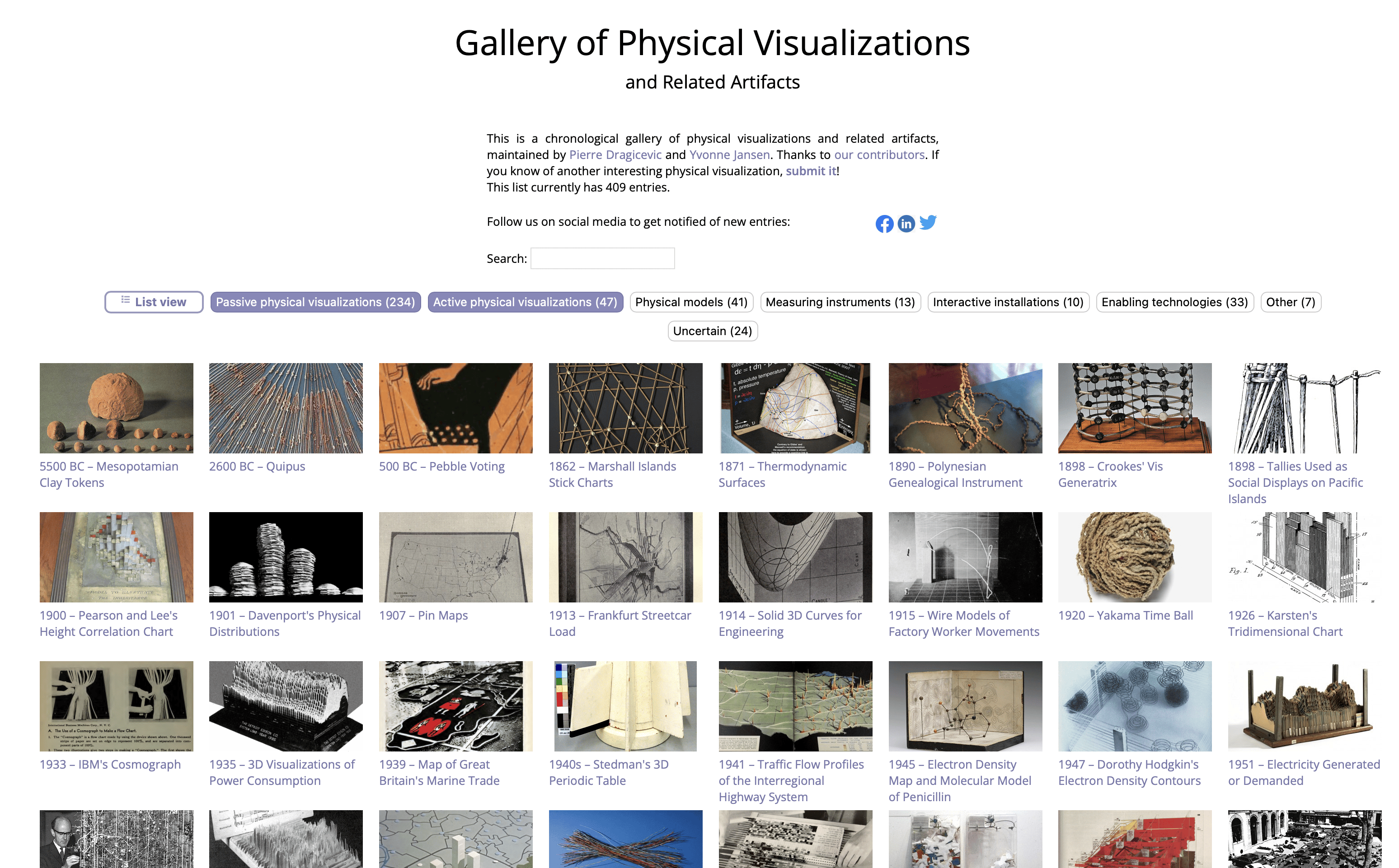
After more searching, I ran across the fantastic Data Physicality Wiki Gallery, with hundreds of super inspiring uses of data (you really need to check this one out, it's amazing):
I also ran across this fascinating article titled Tangible Data Visualizations.
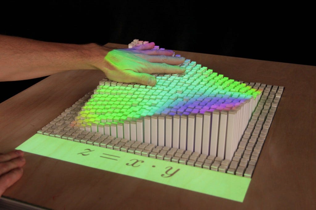
Looking at some of these I am intrigued by the idea of making someone able to actually feel a mathematical formula with their hands:
The same article made me aware of a yearly show called Of All The People In All The World, which is a wildly cool idea to make data evocative:
Of All the People in All the World, also known as the Rice Show, is an art installation and performance by a theatre company in Birmingham called Stan's Cafe, which utilises 112 tonnes of dry rice to represent the world's population, with one grain for each person (about 60 grains of rice—or people—per gram).
Two 20kg bags of rice became the number of people displaced in Darfur.
Individual piles of rice represent various statistics, such as "deaths in The Holocaust" or "the population of England". Topical events are also covered, such as a pile representing the people who lost jobs upon the bankruptcy of Lehman Brothers, which happened during the September 2008 exhibition.
Some of the piles are shaped to represent something associated with the statistic, such as the rice representing the crowd at a football match being in the shape of a stadium, with players in formation. Visitors, or people using the show's website, are invited to suggest new statistics for inclusion.
On arrival, visitors are each presented with a single grain of rice, to represent themselves.

Finally, this little tidbit from the article is quite on point if you ever doubt if it is really worth the investment to make a visualization interactive:
While there is no solid evidence that targeting specific learning styles (tactile, auditory, visual) in education produces better results, kinesthetic learning has been shown to increase overall understanding, as many people retain more information through 'doing,' rather than listening or writing.
As Edward Tufte notes "An especially effective device for enhancing the explanatory power of time-series displays is to add spatial dimensions to the design of the graphic.
On a final, totally unrelated note: I love myself an Amiga Burger
… I must say that the one algorithm that I am really good at making my friend is the YouTube algo.
My YouTube recommendations are the best, and sometimes they bring me incredible gold that I had no idea I wanted and I have no idea why anyone would ever make, that is just pure expression of humanity and defies all laws of capitalism and self-expression and just touches me in weird ways.
This week, it was definitely Four-byte Burger, a restoration of a 1985 Amiga artwork.
This was like nothing else and made me extraordinarily happy, I hope it does the same for you:
Have a spectacular week, and - as always - stay curious. 🧐🐒
Mattias Petter Johansson