
Suggestive plots, CIA plots and techno music plots.
Communicating probability to non-statisticians, CIA uncertainty research, and joy plots that actually work.


Good Monday Morning!
On thing that my mind for some reason keeps on returning to me is the challenge of how to communicate a probability distribution in a user-friendly way.
For example, the most everyday case is the challenge of communicating how long it will take for cab to arrive in a ride sharing app. Most apps opt to show a single number, most likely a median, but in reality, these are probabilistic estimates.
The same problem occurs with loading times, waiting for transfer to go through, etc. (I am personally always a bit surprised when spring arrives in Sweden and start blaming global warming). Other examples are delivery times, or install estimates.
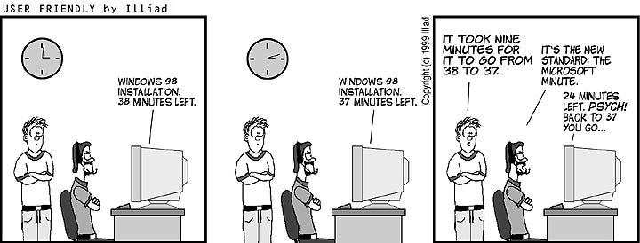
Anyone else here that read User Friendly back in the day?
Anyway, I internetted around last week on how to visualize these distributions in a way that would make sense intuitively for a non-statistican, but I think that the field of visualization is so-so when it comes to this.
Credit: https://xkcd.com/1967/
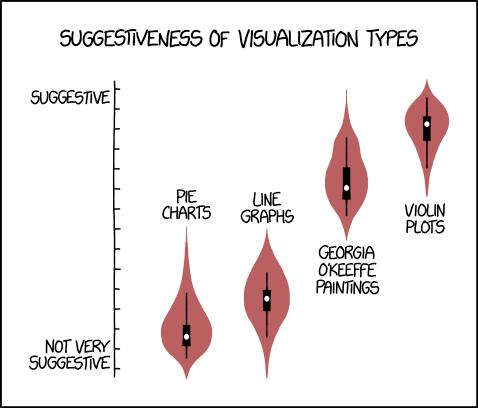
I learned about Violin Plots, which are really not the best, not only because you get a giggly classroom if you do them in certain ways, but for reasons that required a 42 minute elaboration by Angela Collier on why they are both bad and ugly and generally suck.

The above video has a significant follow-up debate on r/DataScience.
Needless to say, I did not watch that video, nor did I read the followup discussion, because I'm not a nerd.
Another visualization that can be used for this kind of thing seems to be joy plots. (I don't quite understand if joy plots are different from Ridgeline plots).
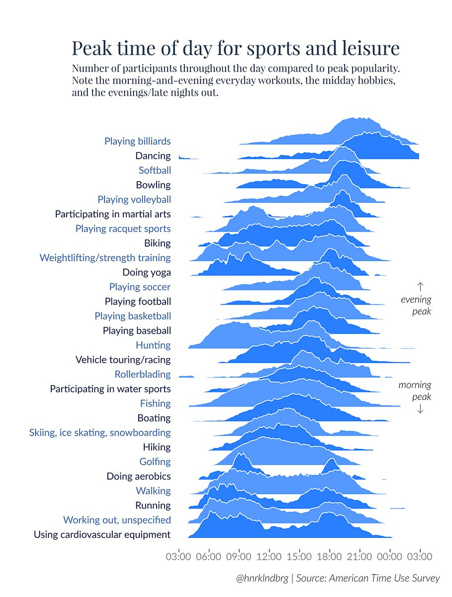
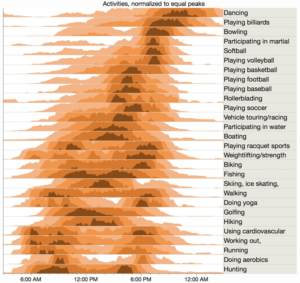
They are kind of okay, and there are ways of varying them with heatmaps which I think adds some improvement of intuitive understandability:
But I still think both of them are tricky to grasp, personally, and I lost interest a bit, and got sidelined and distracted by this graph from a CIA study.
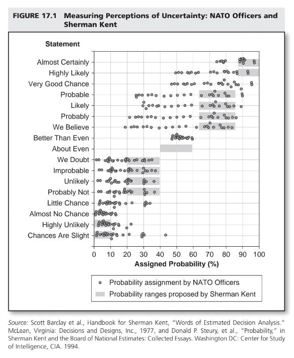
Sherman Kent, the first director of CIA's Office of National Estimates, was a CIA analyst who identified the issue of using vague terms to express uncertainty.
In 1951, when a national estimate used the phrase “serious possibility” regarding the chances of a Soviet attack on Yugoslavia, Kent investigated this further. He found that different policymakers interpreted this phrase very differently—some thought it meant a 20% chance of attack, while others saw it as 80%, with most landing somewhere in between.
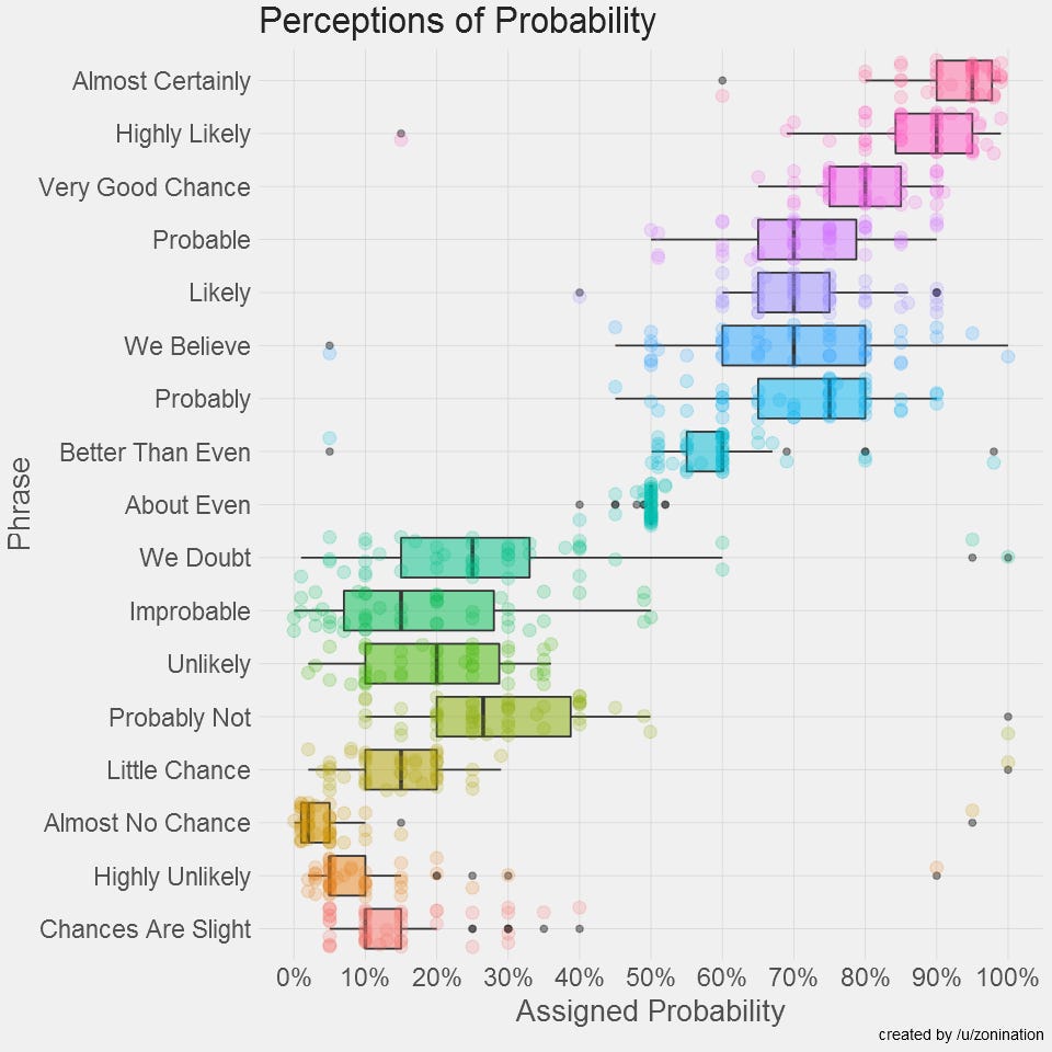
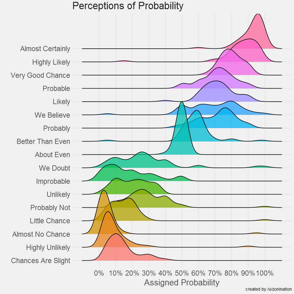
I found this because of a post on r/dataisbeautiful by reddit user zoninantion, who made a small replication of the study (using r/SampleSize which is amazing) and redid the visualizations. Github project here.
zonignation initially replicated using a box plot, but then redid it using a joy plot:
I must say, I really love the CIA. But that is probably because I am biased in the sense that they have never tried to murder me (that I know of).
Public datasets? Pah. I prefer uber-personal data.

I wrote a few week ago about using public data to get started with data development, how the world bank is an impressive but vastly underutilized dataset.
Gasper from Slovenia wrote in and told me that he had been inspired to plow through the Slovenian government portal which has over 5000 datasets but only 20 apps.
However, public datasets is not the only way to go if you want to real data to play around with. The is also the option to go the totally opposite way, and use very private data - your own.
If you are a EU citizen, you generally have a legal Right of Access to any data a company has on you, which is often quite a bit, and it’s interesting to know what they have on you.
A funfun.email reader, Mahadi wrote in and told me a story about how public datasets were not particularly interesting to him, and that he instead has leveraged GDPR to requested out all their raw user data from Spotify and analyzing it was providing lots of fun.
It is much archeology and messy data, but you get ALL of it, every mouse click you've ever made since you started using Spotify, and you can do much more than you can do with just the API.
Also, I have personally been getting into the world of YNAB, and their API seems quite amazing - if you are user, you should consider your financials a dataset:

Bar Chart Races (a chart that works well with techno music)

I want to give a shoutout to one of funfun.email's subscribers, Hatem, who has recently released an open source data visualization library called RacingBars (Sidenote: Hatem is also the author of the amazing OSS REPL LiveCodes).
I really like that someone has made a good lib for this, because bar chart races are a great way to make data more engaging and easily understood.
If you are not familiar with Bar Chart Races, they are a great example of how animation can turn a visualization into something completely different. In a way, a Bar Chart race converts a time series chart to an animated and auto-sorting bar chart, and works really well to add music to, for example:
I am visiting Grenada, Spain in the beginning of November, and it would be really cool to meet some Fun Fun Fans - if you have submitted your city I will be reaching out to people in Spain if I organize something there.